Flight-to-safety is a prime example of why correlations can't always be trusted
Investment would be much simpler if the way that markets reacted to any given event was completely predictable. If X happens, then Y always follows would make for an easier life for all of us. But markets are not that well-behaved.
To panic? Or not to panic?
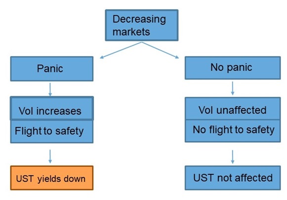
The image below plots two different chains of events that can be triggered by a fall in asset prices. On the left is the archetypal reaction: a market decline leading to investor fear and rising demand for U.S Treasuries as a safe-haven asset. That represents the classic risk-off market move, which results in a drop in Treasury yields. On the right is an alternative scenario: the same fall in asset prices but no panic-induced flight to safety. In the second case, there is no drop in Treasury yields.
Click image to enlarge

There is a whole list of reasons that events might unfold one way or the other. Some of those are quantitative (such as the economic backdrop) while others are more to do with market sentiment. In other words, it depends on the market environment.
Don’t count on correlation
This is a prime example of why correlations should not be relied upon as a definitive measure of the interaction between two investments. Correlation is a simple measure of the extent to which two assets tend to move together: a correlation of 1 (or 100%) means that when one goes up, the other always goes up too. If there is no connection at all between price movements, then the correlation would be zero. Because it is a simple measure, it is handy as a first-order guide to the relationship. But it is an incomplete description of the way assets interact, especially when relationships are non-linear. Correlations are prone to mislead if used carelessly.
In the example above, the correlation between the price of Treasury bonds and other assets is negative during a flight to safety (because Treasury prices rise while other asset prices fall). But during other times, the correlation is more likely to be above zero. Different environments, different interactions, different correlations.
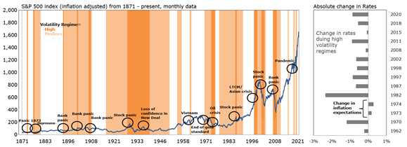
The following chart illustrates how U.S. rates have behaved historically during times of panic. Here, panic is defined as periods where a volatility regime is evaluated to be in high volatility, using machine-learning techniques to infer this hidden state. For each period post-1960 (due to data availability), the behavior of U.S. rates has been evaluated. During each timeframe, whenever the model concluded the market experienced a regime of high volatility, U.S. rates fell—with the exception of 1973-74, which was marked by some unique inflation-related characteristics.
Click image to enlarge
The bottom line
In today’s investment world, an understanding of the interaction between investments has become more important than ever: it is the basis both of liability hedging and of effective diversification. The example above is far from the only example of a relationship that is different in different market environments. As I’ve argued elsewhere, correlations have fat tails, too.
