Putting market pullbacks and “worst” market days in perspective for rattled or complacent clients
 Investors are being hit with an endless string of print and TV headlines about the recent U.S. stock market volatility. Many of these stories are about the “worst day” or “worst 3 days” in the HISTORY of U.S. stocks. But we know that volatility in equity markets is nothing new. In fact, equity volatility is one of the reasons stocks typically provide higher long-term market returns than historically less volatile asset classes.
A little perspective can help ease investor concerns. For instance, consider the following facts:
Investors are being hit with an endless string of print and TV headlines about the recent U.S. stock market volatility. Many of these stories are about the “worst day” or “worst 3 days” in the HISTORY of U.S. stocks. But we know that volatility in equity markets is nothing new. In fact, equity volatility is one of the reasons stocks typically provide higher long-term market returns than historically less volatile asset classes.
A little perspective can help ease investor concerns. For instance, consider the following facts:
- The 14 consecutive months of positive returns U.S. stocks (S&P 500® Index) had experienced by January 31, 2018 likely created an unhealthy complacency for many investors.
- As of December 31, 2017, the average calendar-year stock market (S&P 500 Index) pullback since 1995 has been -14.3%. We haven’t experienced a pullback of that magnitude since 2011.
- The recent market volatility was not “the worst ever” when measured by returns (instead of by index points). To imply it was “the worst ever” is akin to financial malpractice.
An unusually long streak of consecutive positive monthly U.S. stock market returns
Monthly U.S. stock market returns (%):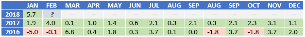 U.S. stocks: S&P 500 Index. Index returns represent past performance, are not a guarantee of future performance, and are not indicative of any specific investment. Indexes are unmanaged and cannot be invested in directly.
U.S. stocks haven’t experienced a calendar year with 100% positive monthly performance since 1926—when Calvin Coolidge was President of the United States. While month after month of positive stock returns make for a pleasant investing experience, this pattern risks lulling many investors into forgetting that pullbacks are normal.
U.S. stocks: S&P 500 Index. Index returns represent past performance, are not a guarantee of future performance, and are not indicative of any specific investment. Indexes are unmanaged and cannot be invested in directly.
U.S. stocks haven’t experienced a calendar year with 100% positive monthly performance since 1926—when Calvin Coolidge was President of the United States. While month after month of positive stock returns make for a pleasant investing experience, this pattern risks lulling many investors into forgetting that pullbacks are normal.
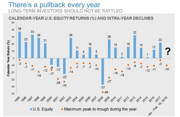
Pullbacks are normal and don’t portend a bad year for stocks
 U.S. Equity: S&P 500® Index.
Source: Morningstar. Returns calculated with dividends included. Maximum peak-to-trough represents the return difference between the largest peak-to-trough of the calendar year. Index returns represent past performance, are not a guarantee of future performance, and are not indicative of any specific investment. Indexes are unmanaged and cannot be invested in directly. Market volatility is not uncommon. Consider the following observations regarding the exhibit above:
- In 19 of the last 23 calendar years, U.S. equity markets finished in positive territory
- The average annual pullback (peak-to-trough) in the last 23 calendar years was -14.3%
- In 10 of the 14 years where the pullback exceeded -10%, the stock market still finished the calendar-year in positive territory
The recent volatility does not represent the “worst” period for U.S stocks
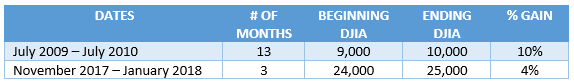
Many recent headlines have been sensational, with references to the down days being the “worst ever.” From an index points perspective, that is true. But from a percentage of return standpoint, it is misleading. Consider for instance the Dow Jones Industrial Average (DJIA). This stock index is limited to 30 large cap U.S. stocks selected by a committee. In July 2010, as the DJIA crossed 10,000 points, it took about 12 months to reach the next 1,000-point milestone. At the time, a 1,000-point increase in the index represented a 10% gain. Contrast that to more recent times: as the DJIA moved from a level of 24,000 to 25,000 points, a 1,000-point increase represented “only” a 4% gain. Of course, a 4% gain is nothing to sneeze at—but it’s a far cry from a 10% increase. As the index level rises, 1,000 points is simply not what it used to be.1,000 DJIA points in perspective
 Index returns represent past performance, are not a guarantee of future performance, and are not indicative of any specific investment. Indexes are unmanaged and cannot be invested in directly.
On February 5th and February 8th, the DJIA fell by more than 1,000 points each. The index had never lost that many points on a single day—let alone twice in four days. However, in percentage terms, these pullbacks were nowhere near the index’s worst days ever. In fact, in percentage terms, the drops were the 26th and 33rd worst days, respectively, since 1985. Said another way, there have been 25 days in the stock market that were worse than February 5th and 32 days that were worse than February 8th. Of course, no investor is keen to see the market lose -4.6% and -4.1% in a single day, but those returns hardly represent the WORST days in the equity markets.Index returns represent past performance, are not a guarantee of future performance, and are not indicative of any specific investment. Indexes are unmanaged and cannot be invested in directly.
Index returns represent past performance, are not a guarantee of future performance, and are not indicative of any specific investment. Indexes are unmanaged and cannot be invested in directly.
On February 5th and February 8th, the DJIA fell by more than 1,000 points each. The index had never lost that many points on a single day—let alone twice in four days. However, in percentage terms, these pullbacks were nowhere near the index’s worst days ever. In fact, in percentage terms, the drops were the 26th and 33rd worst days, respectively, since 1985. Said another way, there have been 25 days in the stock market that were worse than February 5th and 32 days that were worse than February 8th. Of course, no investor is keen to see the market lose -4.6% and -4.1% in a single day, but those returns hardly represent the WORST days in the equity markets.Index returns represent past performance, are not a guarantee of future performance, and are not indicative of any specific investment. Indexes are unmanaged and cannot be invested in directly.
Helping clients reframe 100-point changes in the DJIA
Many investors’ perception of market volatility is anchored around 100-point changes in the DJIA—even today. Little wonder then that a 1,000-point drop caused much alarm. But you can help your clients gain perspective by reframing what a 100-point change in the DJIA means today.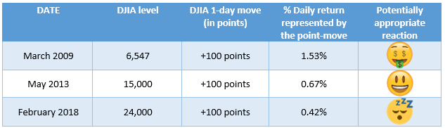 Index returns represent past performance, are not a guarantee of future performance, and are not indicative of any specific investment. Indexes are unmanaged and cannot be invested in directly.
The bottom line
Help turn the recent uptick in U.S. stock market volatility into a productive—rather than intimidating—experience for your clients by reaching out to them proactively to:- Put the volatility into historical perspective
- Remind them this is unlikely to be the last bout of volatility they will experience in their lifetime
- Emphasize the value of being thoughtfully diversified, having a robust financial plan and a disciplined approach.