The bond market is waving a flag that we should pay attention to
The magnitude of returns, up an impressive 335% on a cumulative basis over the March 2009 to March 2018 time period1, has also manifested itself in market valuations. Despite the market volatility so far in 2018, Robert Shiller's Cyclically Adjusted Price-to-Earnings (CAPE) ratio2 still sits above 30, which continues to place today’s market as one of the most expensive ever — in the same ballpark as the market peak in late 1929, and eclipsed only by the technology-led rally in the late 1990s.
This bull run also spans nine years, reflective of the ongoing expansion of the underlying economy since the global financial crisis. The length of both the market upswing, and the economic expansion, rank among the longest on record.
While the equity market is not immune to periodic corrections, bull markets don't typically roll over into more material downside events simply due to old age. That said, we are concerned about significant risks that may arise from a potential recessionary environment, particularly in conjunction with the market valuations noted above.
Given the length of the current economic expansion, it is not a surprise that many imbalances are growing as we get later in the cycle. However, predicting recessions—and the equity market's reaction to such an environment—is notoriously difficult. In addition, market peaks typically predate the actual realisation of recessionary conditions.
Historically, one of the more reliable precursors of recessions has been the slope of the U.S. Treasury yield curve. This is of concern because an inverted curve may reflect an overly restrictive monetary policy that risks destabilising economic growth.
The following exhibit shows that the slope of the yield curve (as represented by the difference between 10-year and 2-year bond yields) has typically inverted in advance of economic recessions. The current spread is now under 50 basis points3, and below longer-term norms. Although the flattening curve is still some distance from an inversion, the recent trend highlights that this spread has been rapidly shrinking.
U.S. Treasury Yield Curve Spread (10-Year less 2-Year Yields)4
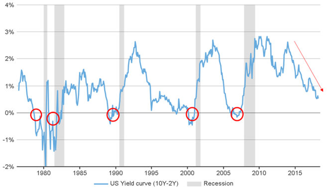
Further, if we extrapolate the U.S. Federal Reserve’s guidance of two more rate hikes (for a total of three) in 2018 into higher yields at the short end of the curve, it is not unrealistic to see the curve inverting should the long end hold steady over the course of the year. The 10-year yield had started to climb higher in the first couple of months of 2018, in response to stronger global growth and the potential for a long-awaited revival of inflation, before retrenching somewhat in late March.
We view the current yield curve spread as a warning sign to monitor closely. Our strategists are also paying attention to other indicators, including corporate leverage and the implications of labor market conditions for future wage growth and Federal Reserve policy.
In summary, while we don't believe the risks of a recession are immediate, we are increasingly concerned with the directional trend of some indicators, including the potential for an inversion of the yield curve. The current market environment, and particularly the backdrop of expensive U.S. equity valuations, highlights the need for heightened vigilance. This includes ongoing consideration of the trade-off between continued participation in the bull market for risk assets and the potential for material losses should recessionary conditions eventuate sooner rather than later.
1 Source: S&P 500® Index
2 Source: www.econ.yale.edu/~shiller/data.htm, updated with estimates by Russell Investments as of March 31, 2018
3 Yields as of March 31, 2018
4 Source: Thomson Reuters Datastream, as of March 27, 2018